
Create a Captivating Logo

By Beth Warren & Gretchen Schisla
A company’s personality and culture is reflected in their logo and it’s the first impression an organization makes to its audience. It tells the story that connects the company’s unique features and attributes to the targeted audience and customer. In best practices, a professional designed logo offers significant benefits to a company’s brand image.
During my commercial leadership roles in directing food industry business growth through customer development over the last 20 years, businesses often overlook opportunities to refresh their logo to improve engagement with their customers and reflect both the market segment points of difference and the company’s culture.

Gretchen Schisla, Founder of Enrich Creative
To offer Two Perspectives, I invite Gretchen Schisla, Founder of Enrich (a St. Louis based creative agency that provides branding and marketing for health and wellness) to offer design insight. Gretchen has successfully partnered with organizations for over 30 years including four of my own company rebranding initiatives to launch impactful and sustainable marketing and branding strategies. She outlines key considerations for logo assessment.
How can you tell if a logo is missing the opportunity to connect?
GS: Let’s start by looking at what characteristics are present when a logo feels generic and isn’t attracting interest:
It’s predictable and blends into the competition
It’s overly complicated and too busy in the design
It’s lacking freshness, energy, and the vitality reflected in the current market segment
It’s low contrast and bland…easy to overlook
It’s too literal rather than conceptual
How do I know what the best logo guidelines are?
GS: To create an impactful logo, let’s start with what a symbol means: expressing or representing an idea or quality without using words. Logos ARE symbols — with them we strive to express the ‘face’ of the company or product.
It’s been said many times that the best logos are simple, memorable, relevant, and timeless. We all know that’s easier said than done, communicating the essence of a company or product effectively is a complex process.
Here are 10 tips to create or refresh your logo for better engagement and connection:
Understand that the logo is only the introduction, the first impression, not the brand. It can’t do it all.
Continuously ask, does your concept align with and visually express the company or product’s purpose?
Be clever, show imagination, buck the ordinary. Your audience expects to be surprised and engaged.
Strive for quick recall of the logo for recognition that builds audience connection.
Combine stellar typography, an impactful visual element, strong color, and white space to express your logo.
Choose typography that is pleasing and communicates personality and voice. The typeface’s functionality also matters because it impacts user experience.
A large percentage of effective logos are made of words and acronyms. By incorporating a graphic element, icon or symbol, you can begin to tell your brand’s story.
Select strong color to influence how your logo is perceived. Pick colors that create feelings and experiences for your audience. Understand color context, culture, and trends.
Test the effectiveness of your logo in both mobile and web formats. Strive for strong contrast, legibility, and easy recognition.
Create an animated version of your logo. Movement captures attention and creates recognition more quickly than a static logo.
We have several projects that successfully executed these practices recently and achieved their business objectives. The following are two examples that demonstrate these best practices (identified by number).
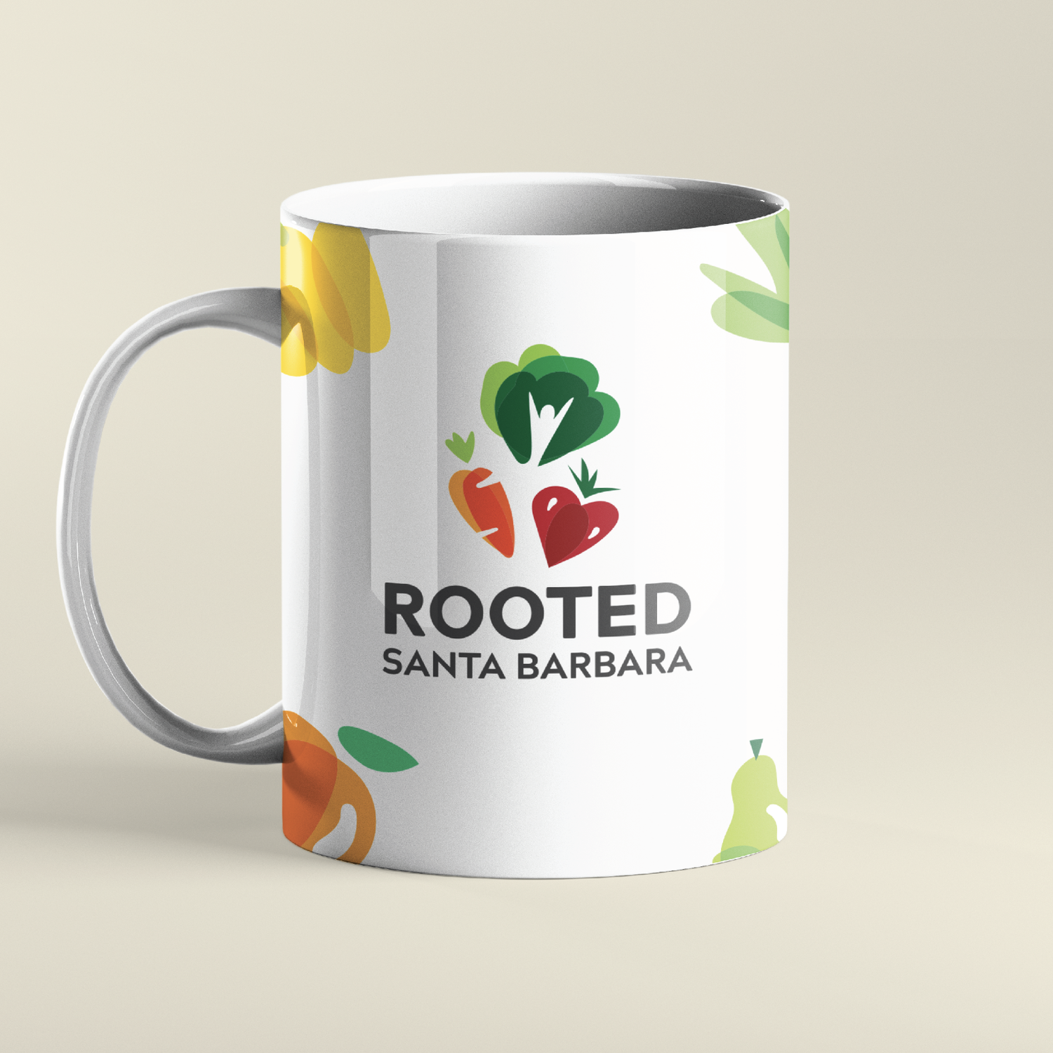
Rooted Santa Barbara
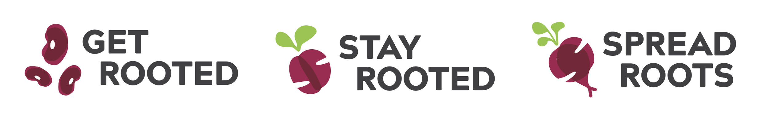
Rooted Santa Barbara is a community-centered, plant-based lifestyle initiative that believes optimal health is rooted in prevention. The organization was established when Beth Skidmore and Emma Malina, local professionals, recognized that underserved communities did not have access to healthy food and nutrition education in the affluent California community. Rooted believes that “Every individual has a right to education, support, fresh fruit and vegetables — no matter what their socioeconomic background.” This non-profit organization provides low-to-no-cost nutrition and food skills education — along with a network of community support to encourage healthy, plant-centered lifestyles. The name “Rooted” and brand image were created with the intention of resonating with all socioeconomic groups.
Does the concept align with the purpose (#2)? Approachable, friendly, and energetic are key attributes to infuse in this mark to appeal to multiple groups. The name ROOTED is a strong name to link the audience and community. All parts of a brand are an opportunity to reinforce the company’s purpose. Here, master positioning and literature written and designed to appeal to a lower literacy group was a criterion that is reinforced throughout the brand.

Buck the ordinary. Surprise and engage the audience (#3). With the saturation of cliché imagery and clip art associated with nature, such as leaves and trees, it’s essential to create icons that feel organic and unique. Using bright, high contrast colors and placing the shapes in a circular position to create motion also helped to draw the viewer in.

Graphic elements, icons, symbols tell the brand’s story (#7). It’s challenging for a logo to communicate the essence of a company — but incorporating icons and visual elements are tools that can introduce the idea of what a company/product stands for. A picture is worth a thousand words, so the logo should be symbolic and not literal. With Rooted, a system of icons become the visual language to describe programs and create a cohesive brand style.

Flavor Producers
Flavor Producers represented an opportunity to update a logo that reflected a company’s growth journey over time. Based on the West Coast, the company has a leadership position in natural and organic flavors with strong customer loyalty. However, it was a brand that was relatively unknown across North America with a limited social engagement and digital marketing footprint in 2019. The challenge was retaining the heritage with an updated branding strategy that would improve and expand customer awareness while highlighting points of difference. A brand mapping exercise with customers and employees revealed the personality and features necessary for the updated logo.
Logo recognition and recall (#4) - The original logo font style was outdated and did not translate well digitally for recognition and recall.

Original Logo
However, the green font color was important to retain for the purpose of connecting the original logo as well as the flavor portfolio reference implied connection to a business that was rooted in nature. Simplifying the logo design as an artistic image would improve recognition and recall.
The process for development this new brand was a collaborative effort. The brand elements were selected with the following in mind:
Natural and organic roots
Plant-based (leaf element)
Open-minded culture (semi-circle)
Digital versatility across platforms

Updated Logo
Typeface functionality / company culture (#6) -The modern sans-serif font style and half circle element was selected for impact and personality to reflect the company’s open culture — which was described in the brand mapping exercise by both employees and customers as approachable, contemporary and unique. Photographic style selection required an appeal to the senses-sight and taste, the essence of what is inspired by nature.
Select strong color to create feelings and experiences for your audiences (#8) - The branding guidelines included a color palette that is derived from the colors of nature and plants: leaves, berries, fruit, vegetables and botanicals. These bright colors create a pleasing connection between the viewer and the logo. Additionally, the leaf element in the brand design reflects the natural and plant-based portfolio of flavors.

The customer and employee response to the updated logo launch in 2020 was enthusiastically positive and accelerated new customer engagement as a result. The updated logo had more versatility with digital marketing platforms and was featured with transparent photographs and strengthened further with the new company tag line “Transparently Delicious®.” The use of transparency reinforced the customer value associated with clean label and the role of natural and organic flavors. Connecting the branding elements to the value proposition in a simple but visually effective way increases customer engagement.


A strong brand illuminates the expertise, creativity and the imagination of an organization. It also fuels recognition, awareness and highlights the value for the market it serves. Invest in the opportunity to assess and audit your brand to better understand if it reflects your company culture today. Does your brand strategy reflect the value proposition of the company portfolio to both existing and potential customers?
The engagement between the customer and the brand fuels opportunities and it is often overlooked as a key driver for successful business growth strategies.